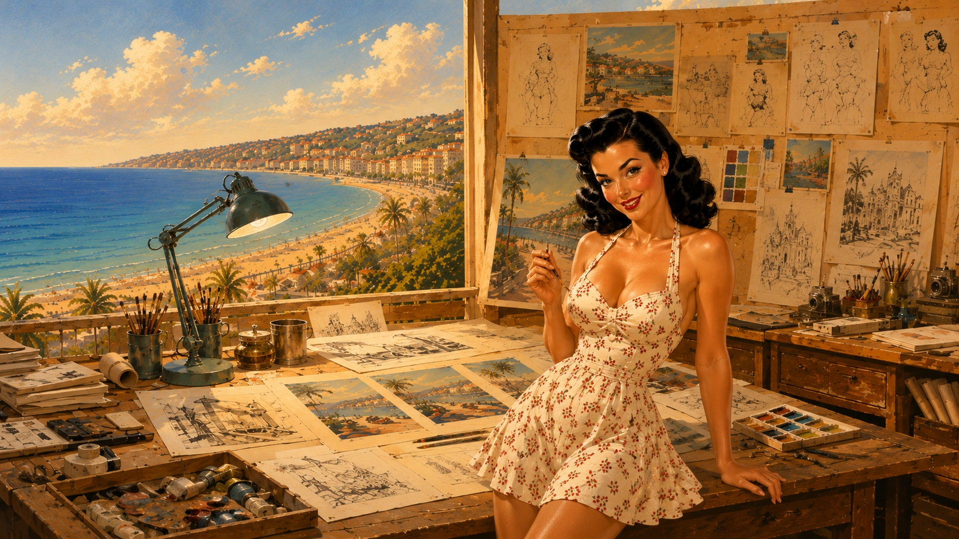
A Caroline’s World poster does not begin with a monument. It begins with a scene. The place provides the setting, but Caroline brings movement, emotion and a reason to look at the image a second time. That is what separates a simple tourism illustration from a genuine fragment of a journey.
The first task is therefore to forget the familiar postcard for a few minutes. The Eiffel Tower, Mont-Saint-Michel, Biarritz and the Dune du Pilat have been photographed millions of times. Reproducing what everyone already knows is not enough. We need the small event that gives Caroline a reason to be there.
1. Find the story before the image
Everything starts with a very simple idea: holding up the Leaning Tower of Pisa, walking into the wind on a dune, carrying a surfboard in Biarritz, watching the tide at Mont-Saint-Michel or picking a bunch of grapes in Burgundy. That action becomes the anchor of the composition.
This is also when the viewing angle is decided. Caroline may be almost front-on, in profile, three-quarter view or seen from behind. Changing her orientation keeps the posters varied without losing her identity. Her gaze then becomes a tool for guiding the viewer's eye towards the landscape.

2. Build the composition
A strong composition has to work before any detail is added. We check the overall silhouette, Caroline's position, the depth of the setting and, above all, the breathing space. In the Caroline’s World universe, the image must remain clear enough to later accommodate the logo and destination name without suffocating the scene.
The idea
A place, an action and an emotion simple enough to be understood instantly.
The silhouette
Caroline's pose, the direction of her face and the way her body interacts with the setting.
The setting
The essential elements needed to recognise the place without turning the image into a tourism catalogue.
Light and palette
Colours inspired by great illustrated travel posters of the 1950s: bright, soft and slightly idealised.
The details
Accessories, folds in the clothing, hair, vegetation and small irregularities that make the scene feel alive.
3. Choose colours that tell the era
The style does not rely on clothing alone. A palette that is too realistic would immediately push the image towards contemporary photography. Mid-20th-century travel posters often simplified volumes and intensified certain hues to create a feeling rather than an exact reproduction.
Softer skies, stronger reds, slightly warmer greens and less grey in the shadows: these choices build the atmosphere before the details are even noticed.

4. The detail that makes the moment believable
An image can be beautiful and still feel perfectly static. What creates the sense of a lived moment often comes down to almost nothing: a few strands of hair moved by the wind, a skirt following a movement, a naturally placed hand, a towel peeking out of a basket or a footprint left in the sand.
These details are not decorative. They tell us what has just happened and what might happen next. That is where the poster stops being simply an image and becomes a piece of Caroline's journey.
5. Only at the end does the image become a poster
The final artwork is deliberately created without an integrated title. This keeps the image clean, reusable and adaptable. The Caroline’s World logo, destination name and graphic elements are then added separately, with precise control over size, spacing and balance.
Separating illustration from typography also lets the same universe live elsewhere: on a poster, of course, but also on a mug, tote bag, T-shirt or cap, without forcing every format to use exactly the same composition.